NEXT DOOR

NEW YORK Branding

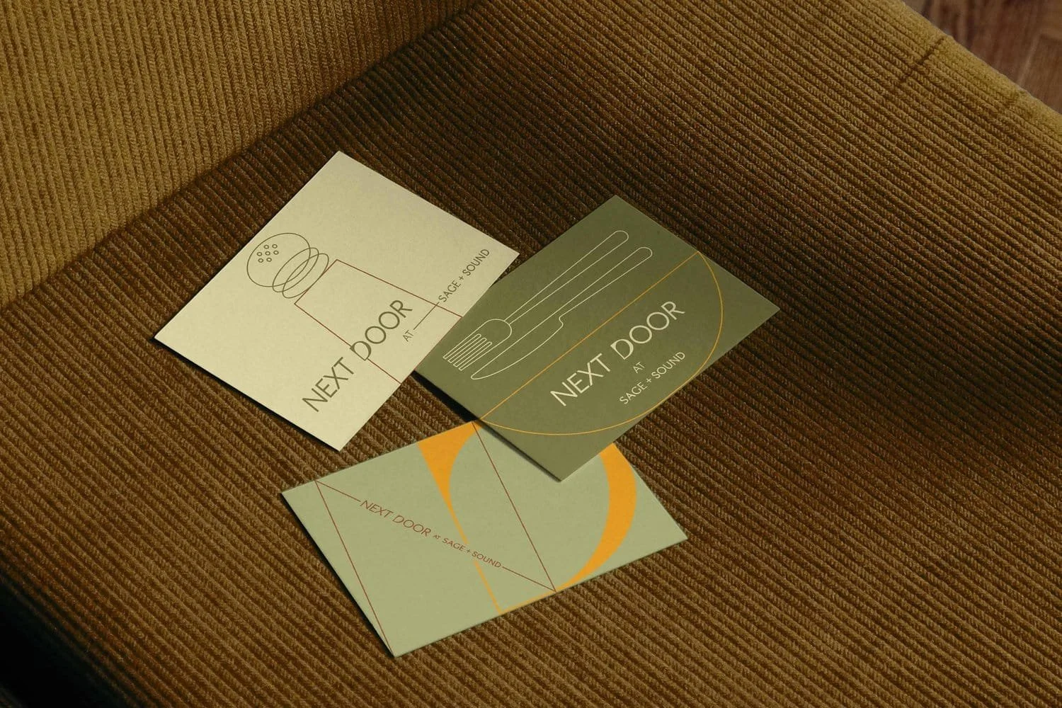
Inspired by Next Door’s mission to educate its community about balance, we created a direction that is in harmony with the Sage + Sound’s logo and the space around it. We use the negative space to represent a calm and sophisticated brand, pairing graphics that allow you to be playful but still quiet and clear.

Brand Identity - Signage - Social Media Assets - Logo - Merchandising

Soft shadow of NEXT DOOR logo embodying balance and calm | The Morris Project
NEXT DOOR iced coffee cup with minimal branding design | The Morris Project
NEXT DOOR coffee cup with sleek branding under espresso flow | The Morris Project
NEXT DOOR tote bag with minimal design and clean lines | The Morris Project
NEXT DOOR branded cap with clean, modern typography | The Morris Project
NEXT DOOR branding cards with refined lines and earthy tones | The Morris Project
NEXT DOOR tote bag in warm earthy tones with minimal design | The Morris Project